Overview
At the time, Apple Maps did not have lane guidance information, and all major competitors did. It was time to decide on the next feature set, and our team wanted to give users a better driving experience.
As usual relating to Apple, I must blur many designs and omit much information, but I will do my best here regardless.
Iteration
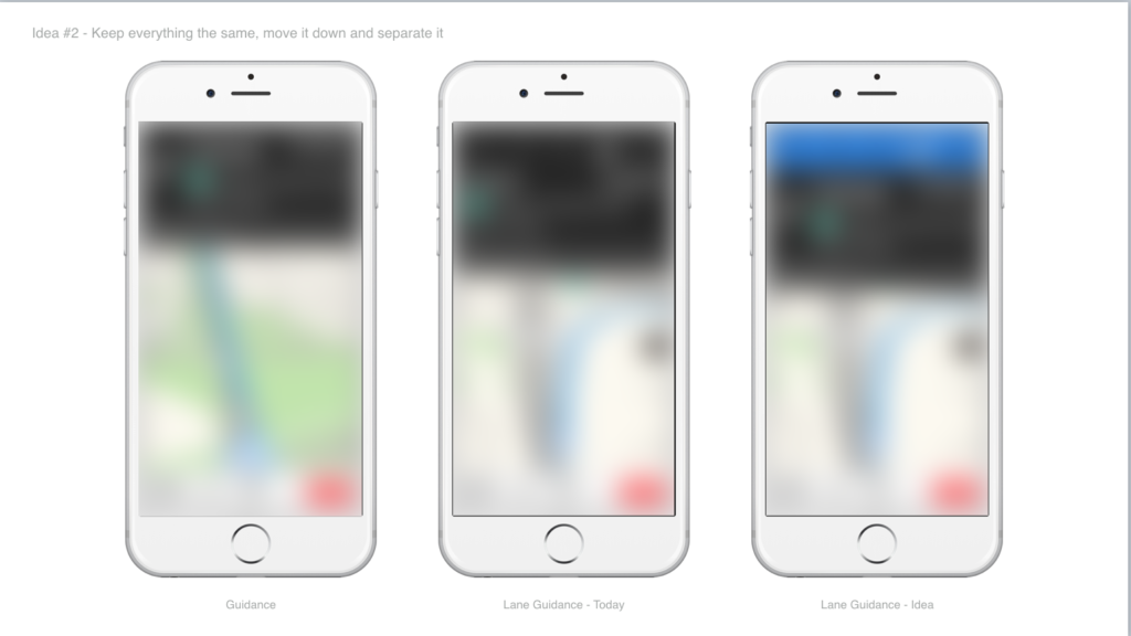
I have great designs, I swear. What I can actually show is screenshots (from a consumer phone, and a public iOS) of the product we shipped and describe more about them
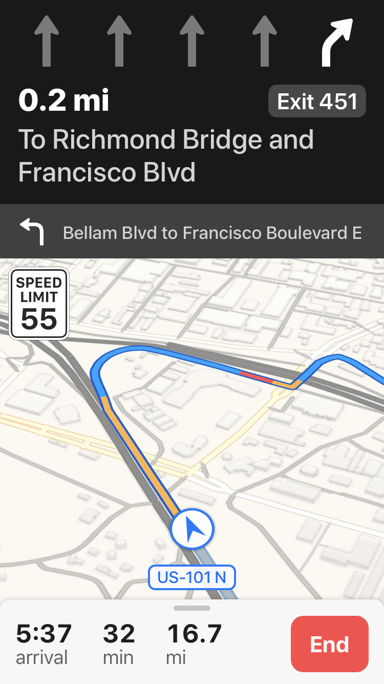
We ended up with a very clean arrow set, and at the top of screen. I played with quite a lot of different options before settling there. Some really interesting, out-of-the-box ideas. I personally think it is the right place for a 2D set of arrows within navigation guidance.
The camera perspective you see here was also a big project of mine, and you can read more about it here
Animations
Animation is key. When we change things up, we want you to notice.. unless we don’t. There’s a hierarchy here in a big way.
Fading or Morphing isn’t as noticeable. Sliding the whole bar across is. We can use these in different situations where we want, or don’t want, to get your attention.
Edge Cases
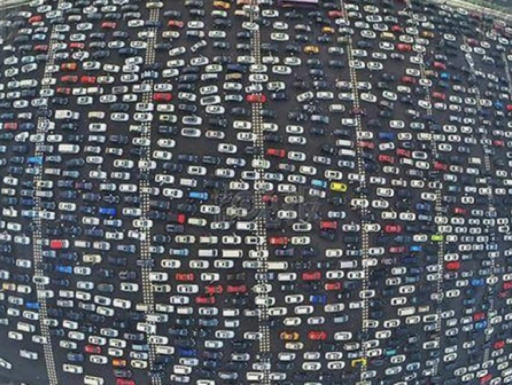
What happens when there are 20 lanes? It’s more common in China, and even then it’s not everywhere, but it happens and the design needs to support it. After X number of lanes, they get too small to show on the screen effectively. Our solution was to have X be a maximum number of lanes shown on the screen, with a visual fadeout on the appropriate side of the screen intending to indicate there were more yet they don’t really matter for your maneuver.
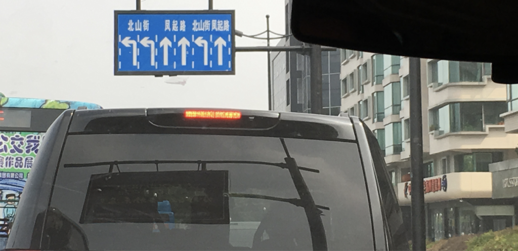
In larger cities in China it’s not uncommon to have left turn lanes from the middle or right side of the road (even though they drive on the “right” side). There were opportunities for our product to look silly unless we specifically took this into account.
Guidance Frequency
Is there such a thing as too much guidance? Imagine maps telling you every 3 seconds what you need to do, or not do. Imagine the instructions on your phone changing every 3 seconds so you feel like you always have to be staring at it.
There’s a sweet spot, for sure. Too little instruction and I feel lost. Too much and it becomes just as useless. Furthermore everyone has a different preference for these questions, and a different preference in different situations.
It feels like Apple’s usual answer to product design is “This is what you need to use, this is how you need to use it”. To some extent I agree with this, but in this case I felt a little boxed in. Other mapping competitors do this as well but also provide a few more options and hidden sliders for those willing to hunt for them.
We spent time exploring how much guidance, specifically regarding lanes, to give the user and in how much force.
Deliverables
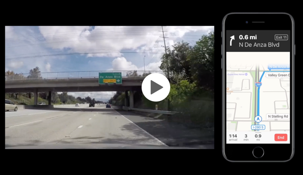
I believe that part of being a good designer is being adaptable to collaborating in different ways.
The design team I was a part of was accustomed to delivering keynote presentations to the engineering teams that included specifications like pixel specs, edge case explanations, and visual examples of the product and how it behaved. I started with this approach, explaining timing with images and written descriptions. But I ran into an unexpected level of confusion.
I tried something else! I took to the streets and drove a few routes that I felt demonstrated different (both simple and complex) scenarios. I was recording dashcam and the default Maps experience screen in sync. Using After Effects & Premier, I superimposed my designs onto the default experience to simulate what the experience should look like in the end result. Delivering this worked wonders with this specific team, so I continued to deliver this way. As I iterated on designs, timing did change and I had to keep updating the videos, but it was worth the time to end up with a great looking product.
Field Testing
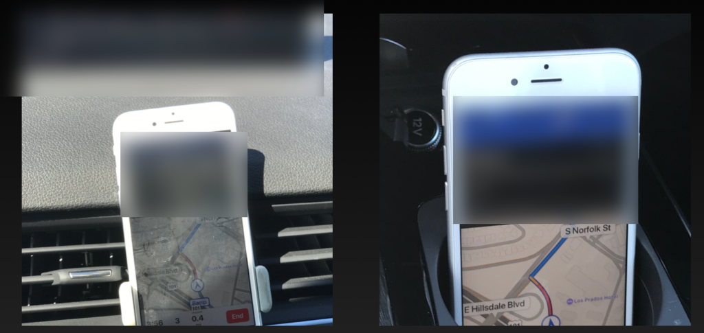
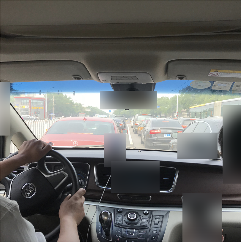
First-hand field testing, domestically and internationally, was an invaluable experience as a designer.
Data Quality Evaluation
The data we had available at the time was not perfect. It had significant problems in some areas, and there was serious discussion of punting the feature entirely. Apple’s policy on releasing an imperfect product, especially in Maps after the quality in the initial launch, is very straightforward.
As a team, we were looking at a lot of spreadsheets and statistics regarding percentage and severity of issues. It felt hard to get a feeling, as a driver, of how big of a problem this was. So I took a full day to drive around the San Francisco Bay Area and see how it felt.
I can’t describe my findings in full detail here, but in some cases, our directions worked great and I got where I was going. In other cases, our directions causes me to miss my turn and go the wrong direction. But I noticed a pattern in how and where these errors were occurring.
Going back to my desk and digging around in the data, certain situations did indeed have a much bigger percentage of errors than others.
Instead of removing the feature, we were able to isolate certain situations, suppress them, and continue shipping the feature on time, with a plan of continuing to evaluate and fix the data in all situations post-release.
Marketing
I worked closely with the marketing teams to pick single unique situations that best demonstrated our product, and provide images and screenshots.
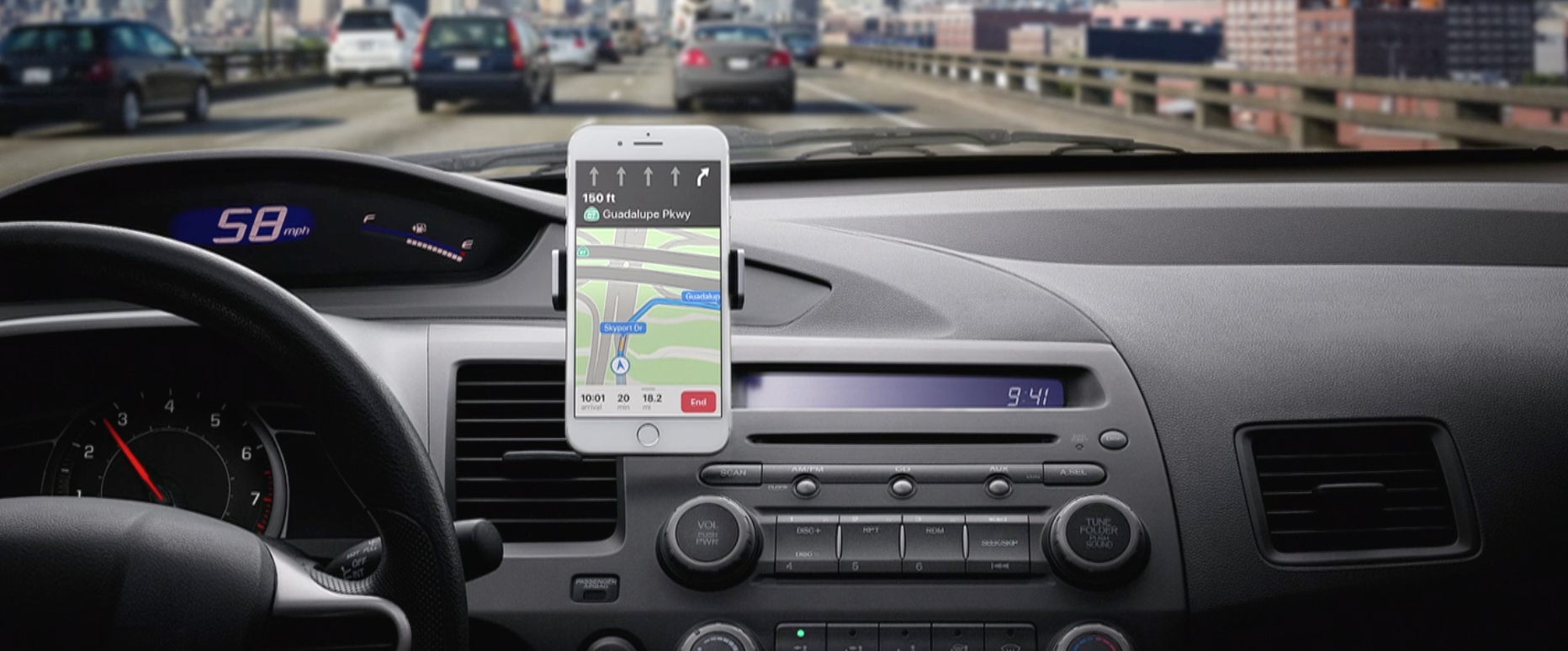
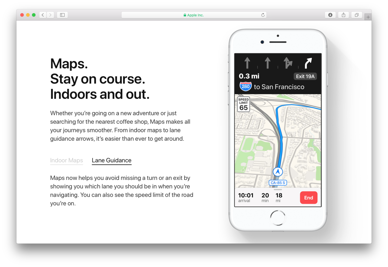
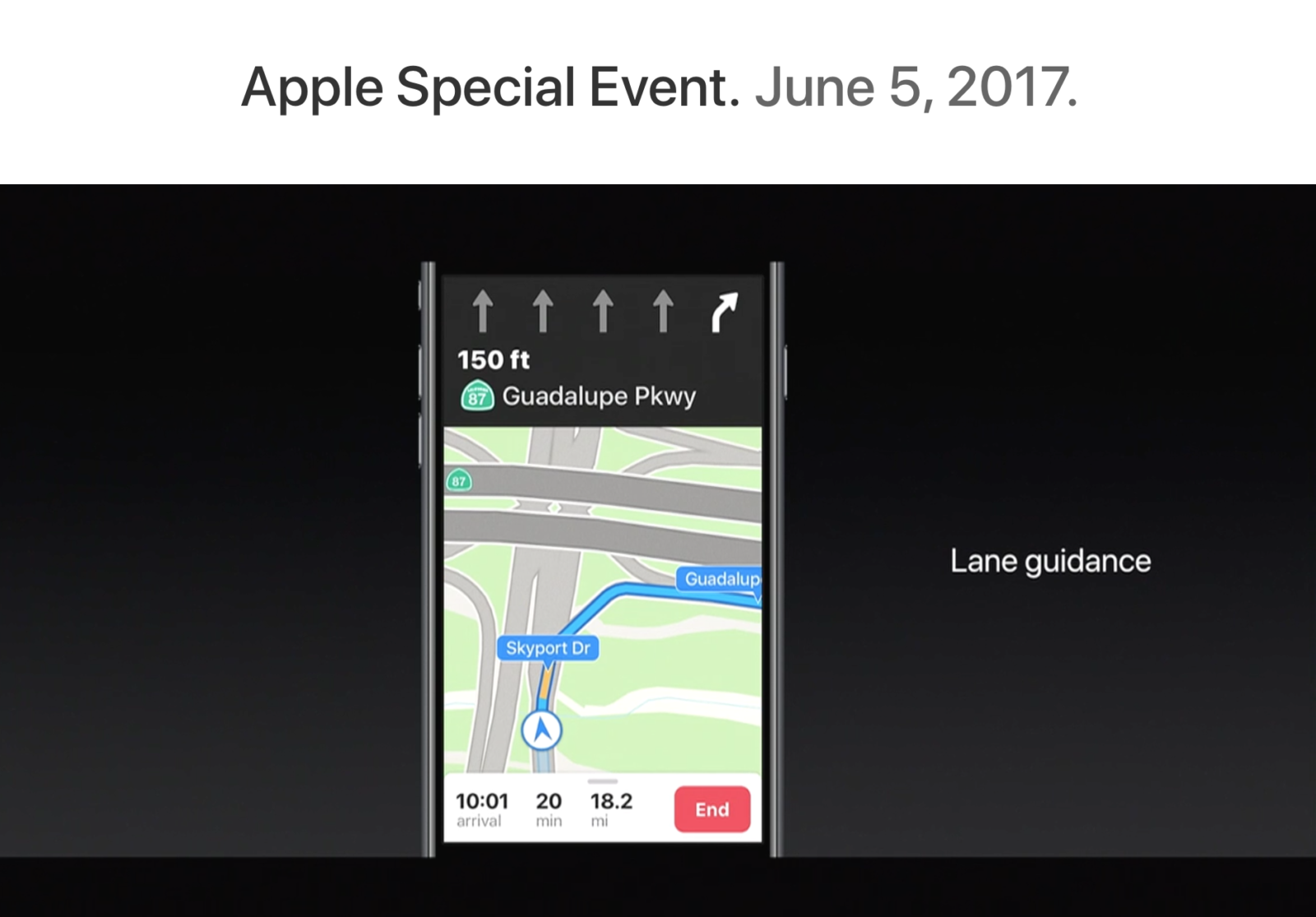
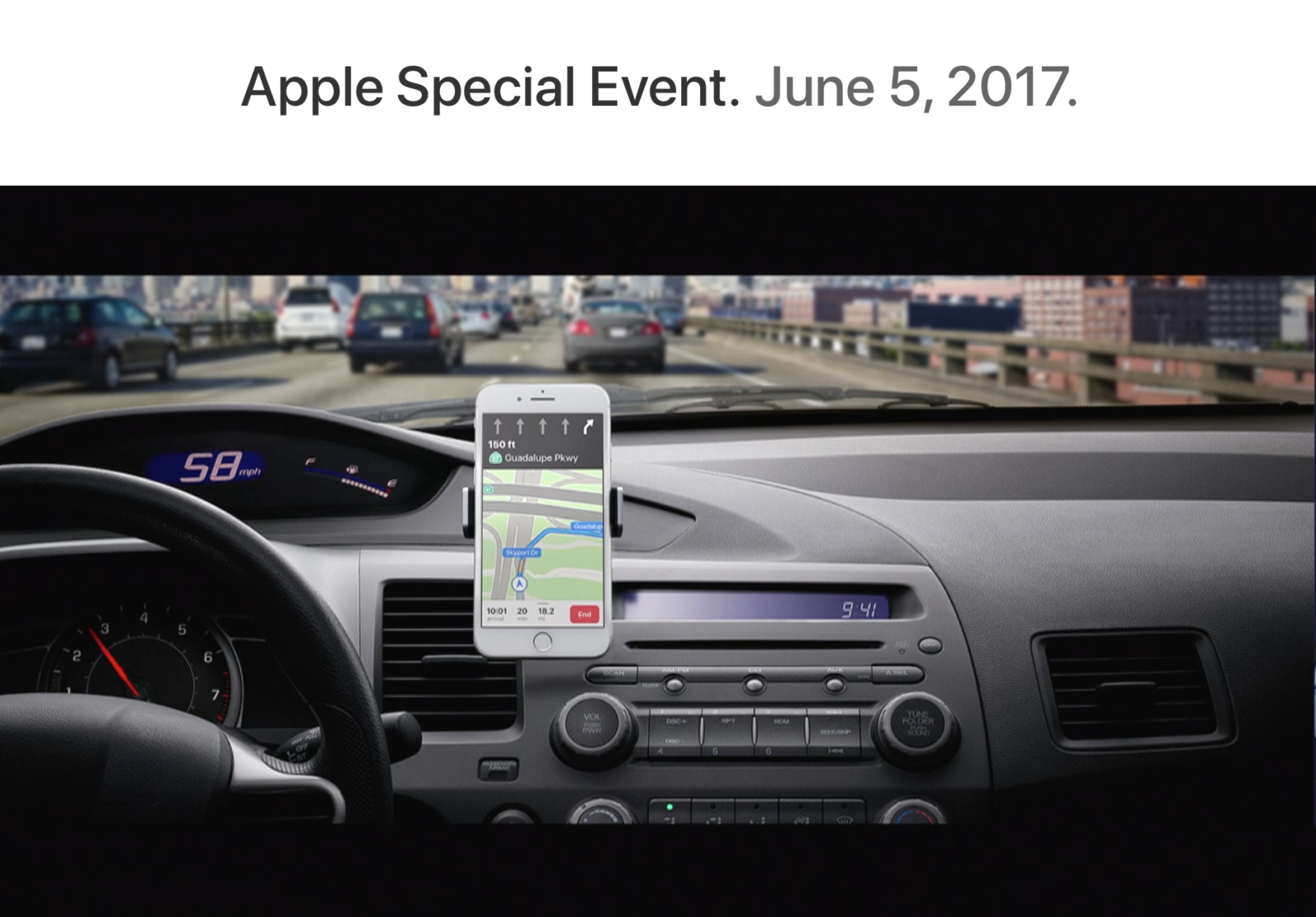
This was one project (of several) where I took an idea from a concept all the way through into a polished, released product. I find my specific role changes a lot throughout that time, and that’s something I enjoy; helping where I can and is needed most.